
Introducing the New Masonry Layout for Stocks in Cotoami
Posted: August 22, 2025 Filed under: uncategorized | Tags: knowledge-management, open-source, technology Leave a commentCotoami offers two main ways to view your input: Flow and Stock. In the screenshot below, the left side shows the Flow timeline, while the right side displays pinned items in the Stock.
Flow is an unstructured stream of posts arranged in chronological order, where you can casually throw in any information without hesitation. From there, you can pin items that matter to you and collect them in the Stock on the right, gradually building a structured knowledge base. This is the basic way to use Cotoami.
Until now, Cotoami has provided two layouts for viewing Stocks: Document and Columns.
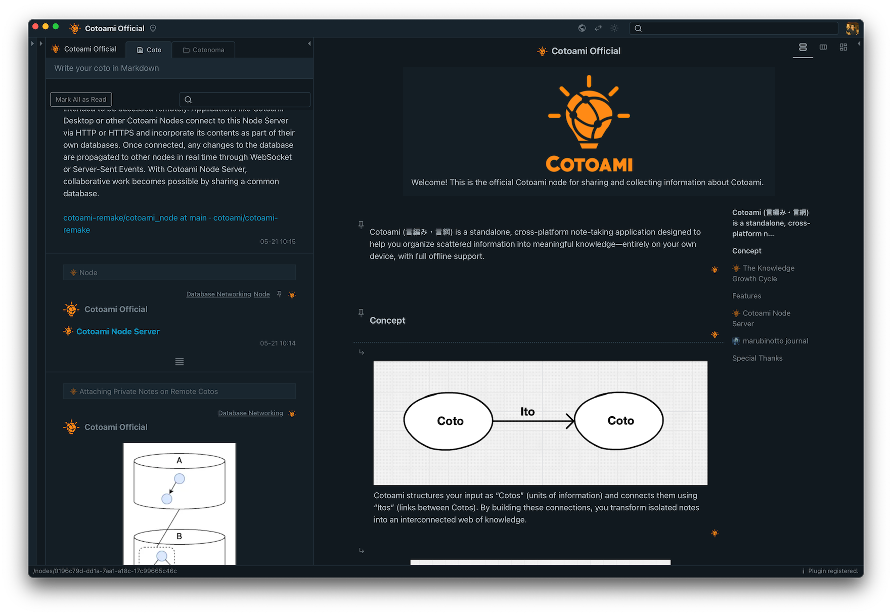
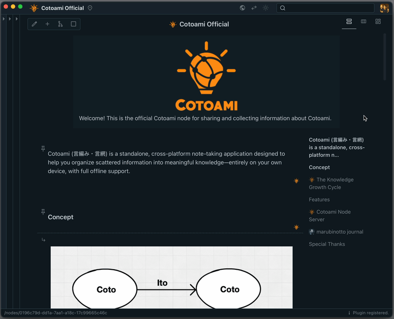
In the screenshot above, the Stock is shown in Document layout, with a table of contents on the right. This makes it easy to “read” the information as a standard document, which works especially well when you have a Stock with a lot of text.
With Columns, information is displayed side by side, as shown below. This layout is particularly effective for Stocks that include many lists, such as TODO lists. Personally, I often use it like a kanban board.
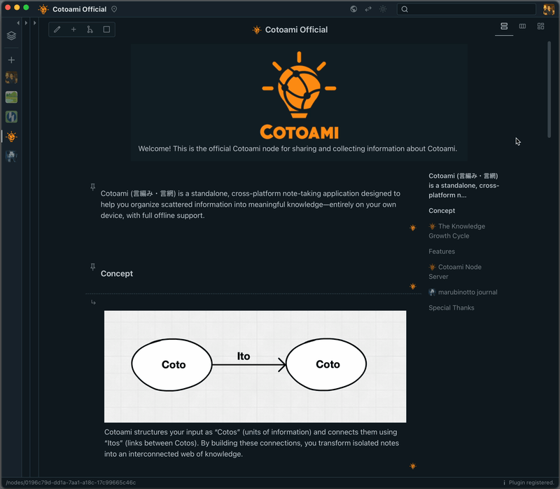
In the latest version of Cotoami, I’ve added a new layout: Masonry. This layout arranges individual items in a compact, tiled style, making it easy to take in the big picture of your Stock at a glance. You can also adjust the element size with a slider.
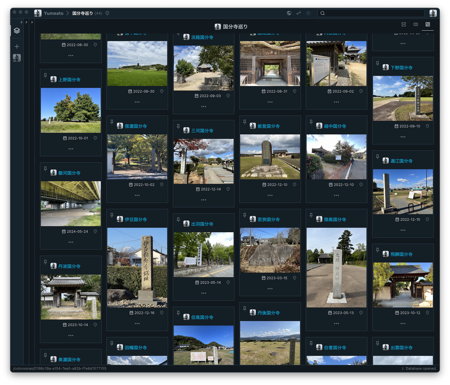
The masonry layout is especially useful when working with Stocks that contain a lot of images, as shown below.
What do you think of this new feature? Since I use Cotoami to plan and record my travels, this addition has become personally very important to me.
If you haven’t tried Cotoami yet, please download it from the release page below and give it a try. Installation packages are available for macOS, Linux, and Windows. And I’d love to hear your feedback!
https://github.com/cotoami/cotoami-remake/releases/tag/desktop-v0.10.0


Recent Comments